Brookfields Day Nursery provides childcare for children aged six weeks to twelve years old. Their approach is caring, inclusive, and focused on early development through play and creativity.
We refreshed their logo, updated their visual identity, and introduced a preliminary website update to align the brand with its warm, playful values.
The existing brand identity was:
Dated and inconsistent across materials
Lacking cohesion between digital and print assets
Visually unclear and hard to scale
Not reflective of the nursery’s friendly and nurturing environment
The brand needed a fresh, cohesive identity that appealed to both parents and children while remaining professional and trustworthy.
We focused on creating a bright, friendly identity that captures the essence of early learning and care.
Key goals:
Retain a sense of familiarity for existing families
Improve legibility and scalability of the logo
Introduce a more modern, digital-ready brand system
Use colour and typography to evoke warmth, playfulness, and trust
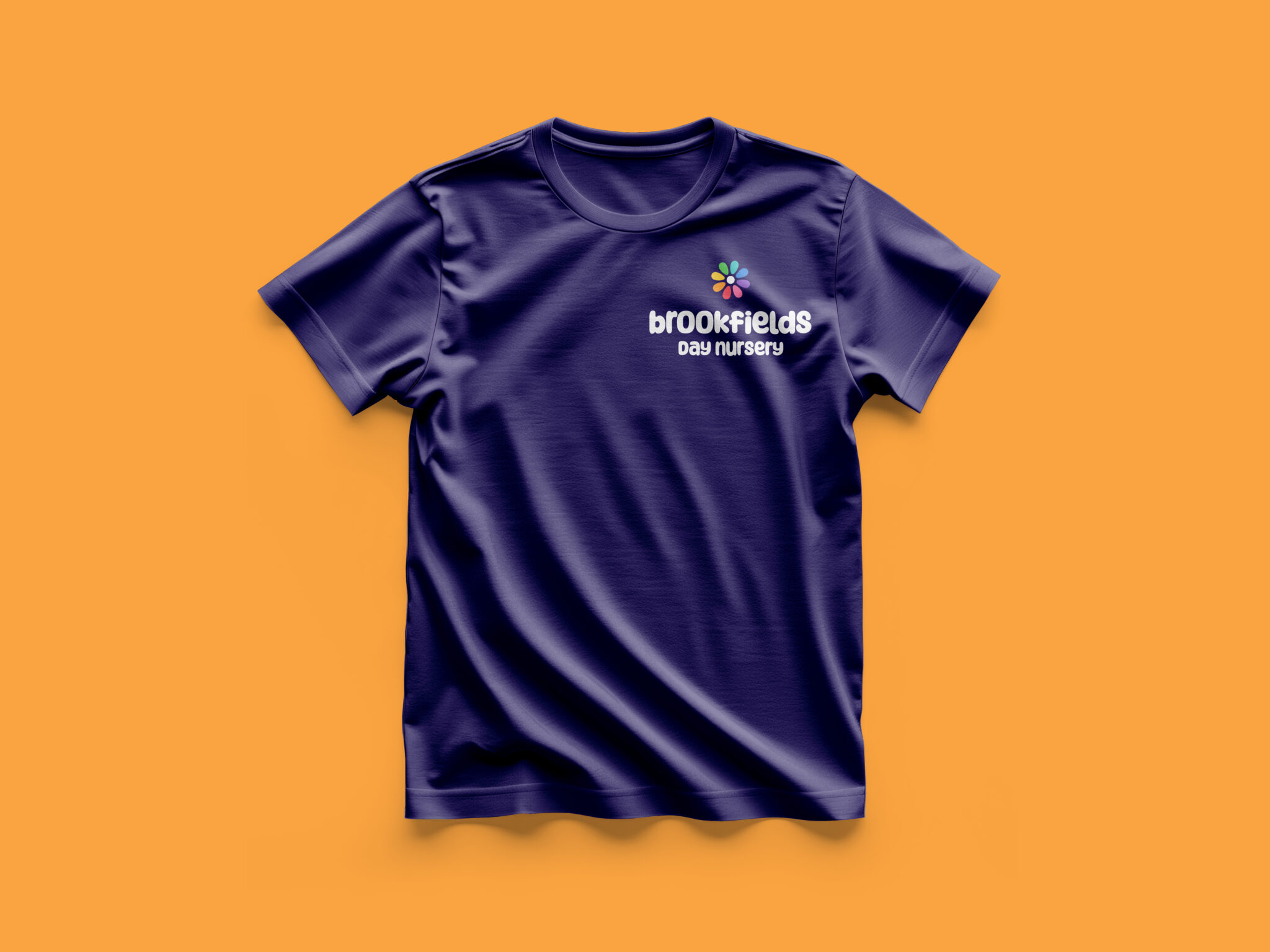
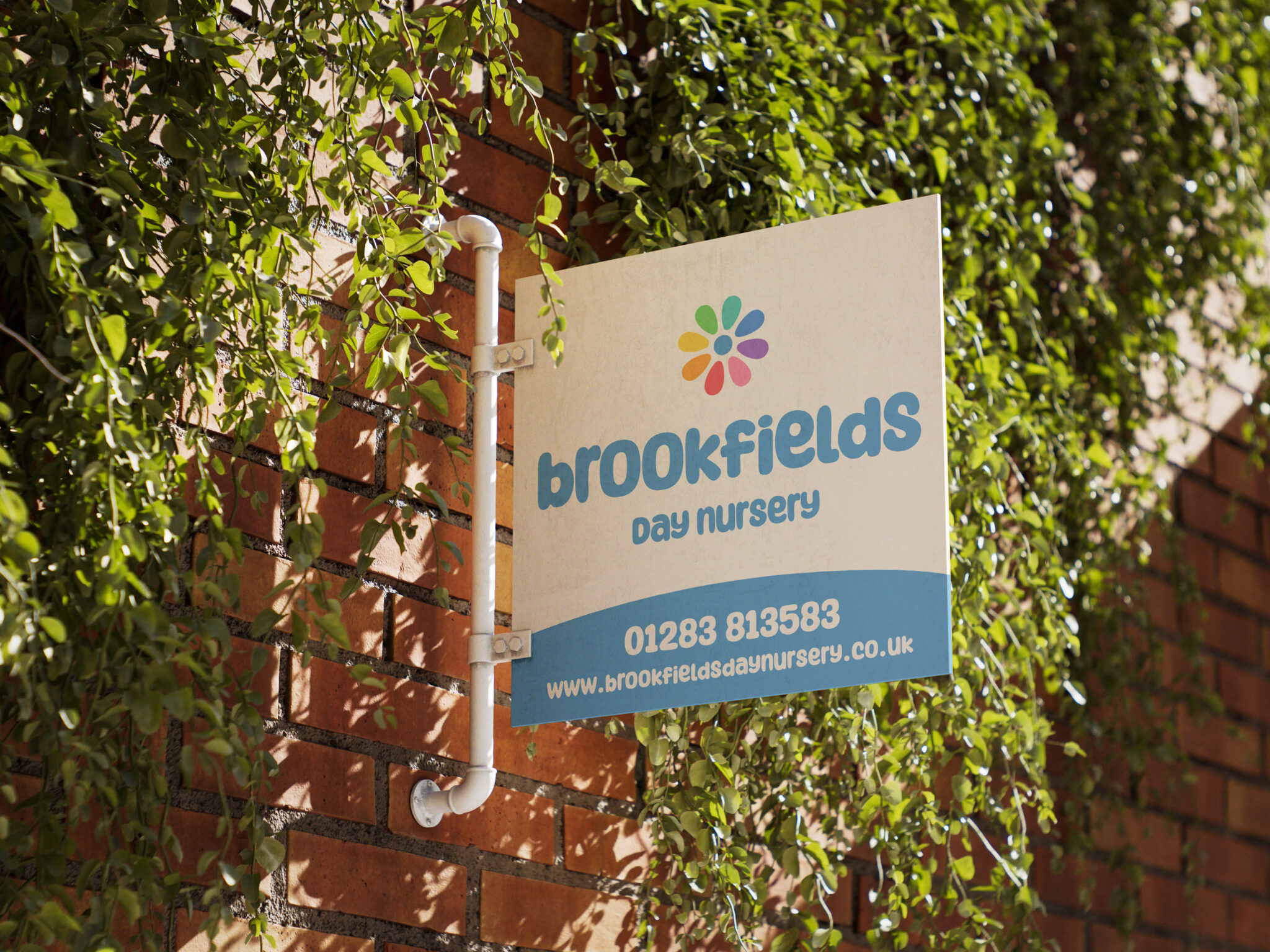
Logo and Brand
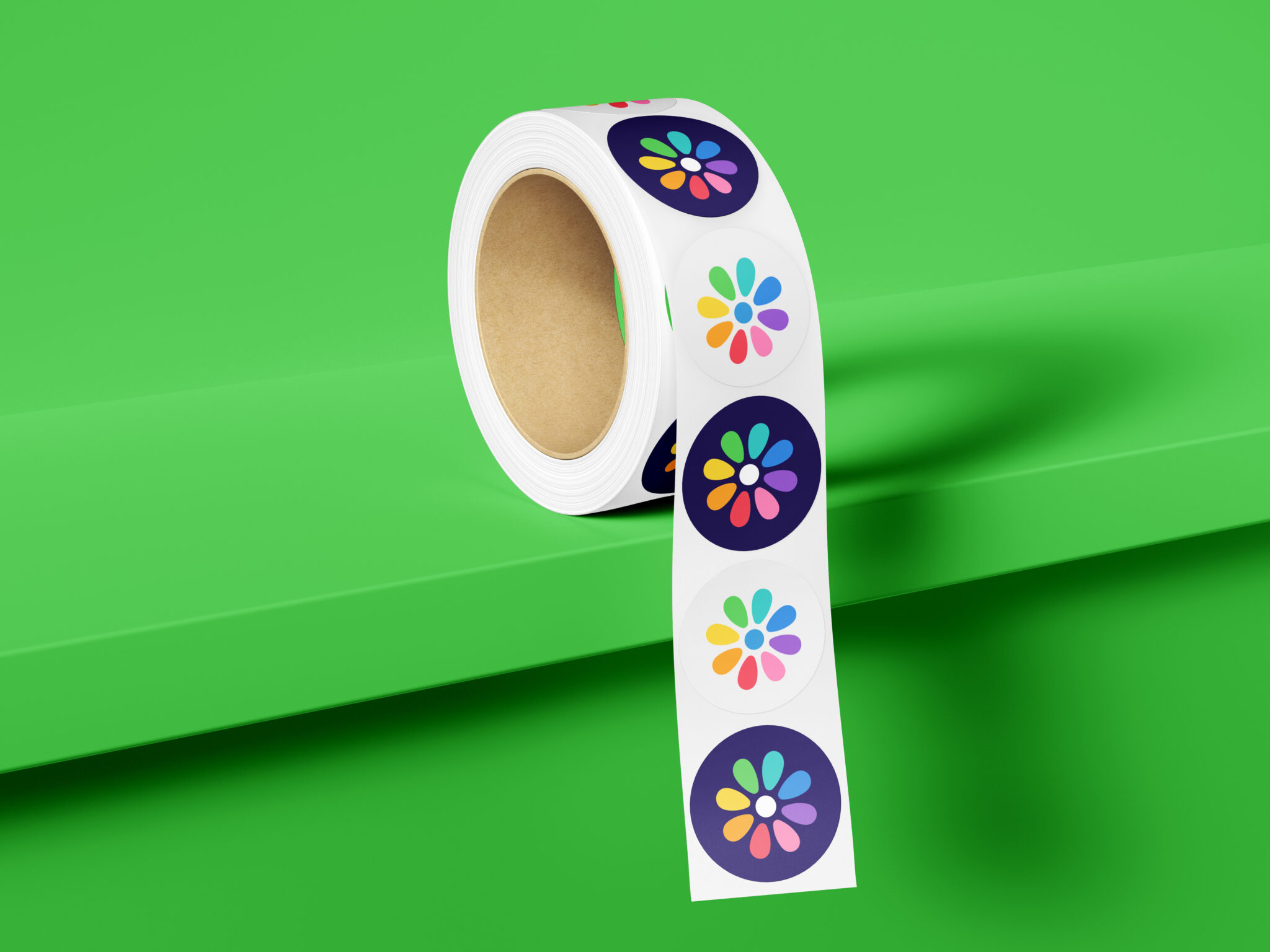
The new logo features a rounded, approachable typeface paired with a colourful flower mark symbolising growth and diversity.
We refined spacing and proportions to ensure clarity at all sizes.
A vibrant palette of blues, oranges, greens, and purples gives the brand energy and positivity.
Visual Identity
The updated identity extends across uniforms, signage, and print materials.
The new look feels cheerful and consistent, helping Brookfields stand out among local nurseries.
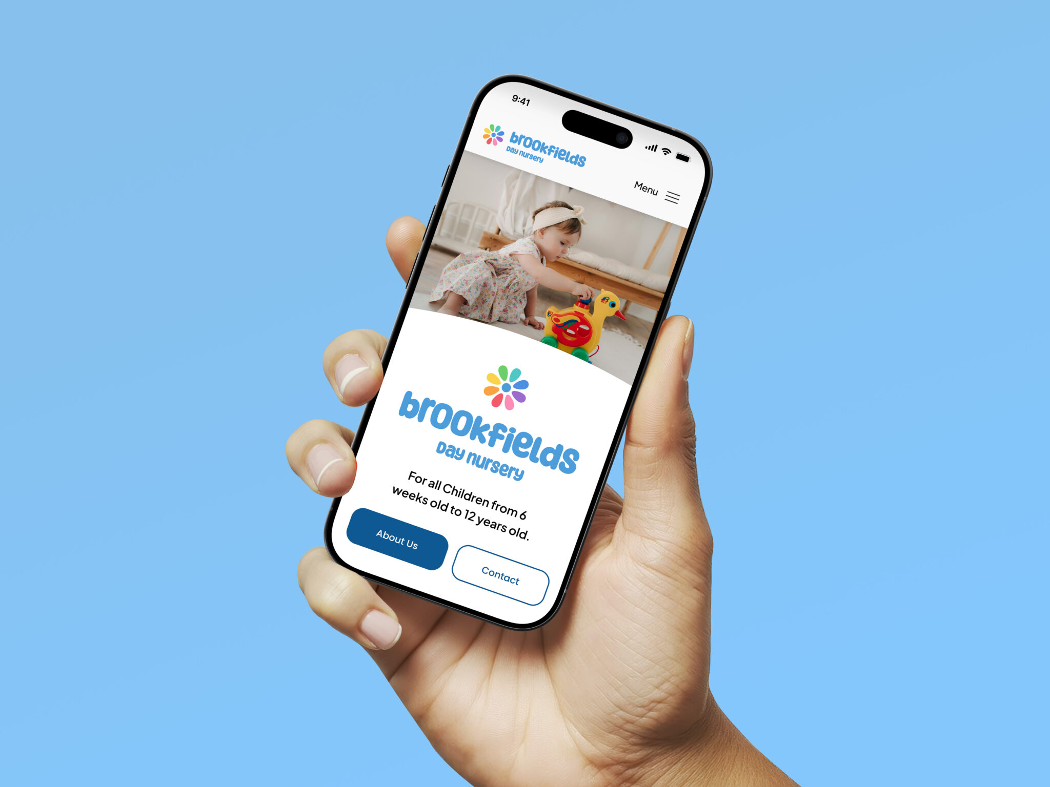
Website Update
We redesigned key pages of the website with clearer layouts and a refreshed visual style.
Improved typography, colour use, and imagery now create a more engaging experience for parents exploring childcare options.
The update also lays groundwork for a full redesign in future.